Westrac
Updated visual identity for leading Belize John Deere dealer
Westrac Ltd., Belize’s largest supplier of automotive and agricultural parts, has been a trusted name since 1969, delivering reliable service to farmers, industrial operators, and everyday customers.
Westrac’s outdated logo no longer reflected its growth, innovation, and leadership. A refresh was needed to communicate its values and aspirations while honoring its legacy.
Brand Goals and Look & Feel
Through workshops, Westrac identified key traits for the rebrand:
• Reliable & Dependable: Reinforcing trustworthiness and consistent performance.
• Everyday Solutions: Highlighting accessibility and relevance.
• Leading & Respected: Showcasing leadership and respectability.
• Responsive & Efficient: Demonstrating agility and efficiency.
Look & Feel
• Modern & Relevant: Reflecting innovation and adaptability.
• Established: Emphasizing reliability and history.
• Bold & Confident: A strong visual presence.
• Approachable: Welcoming and open design.
• Industrial: Practical and robust aesthetics.
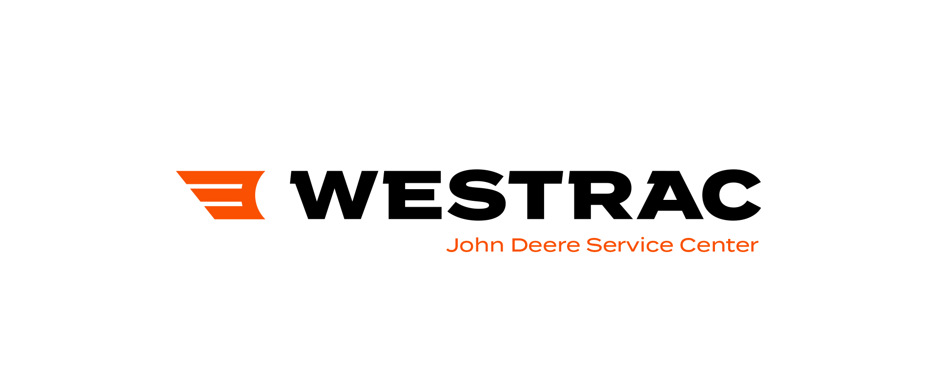
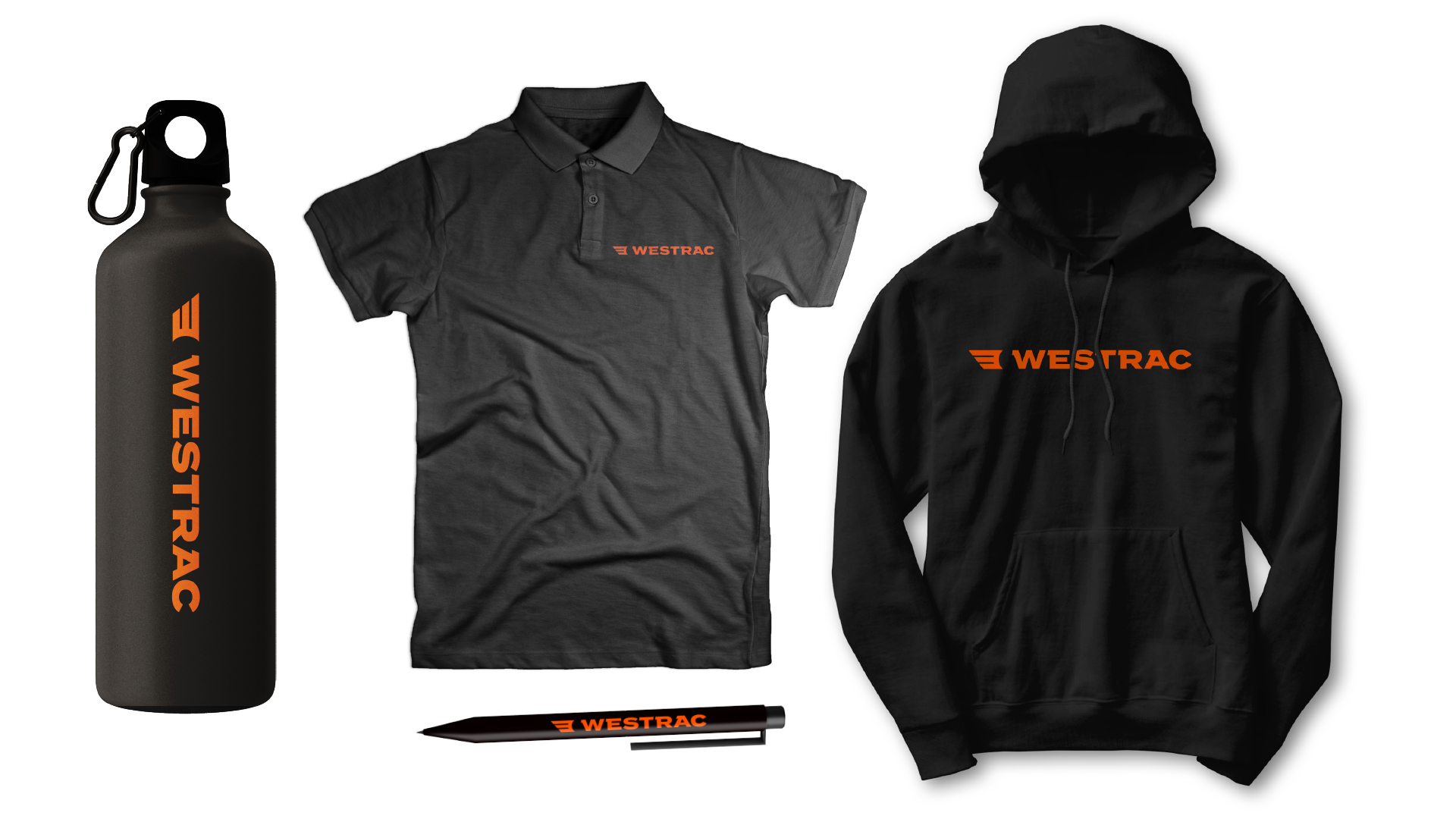
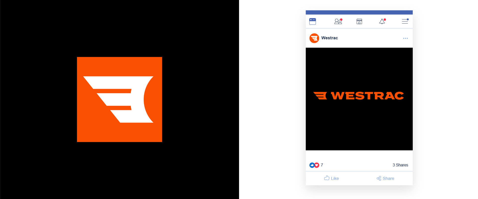
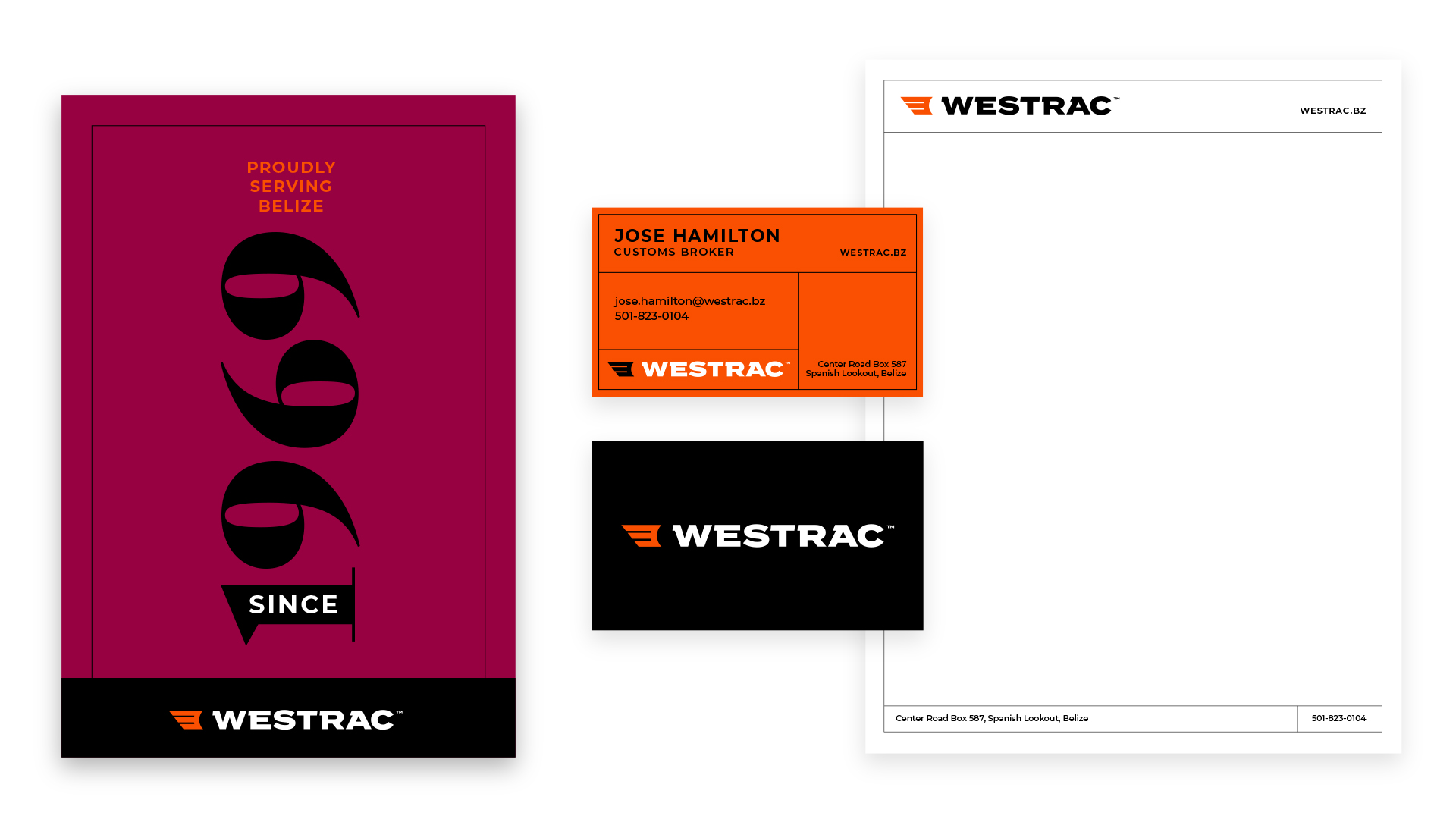
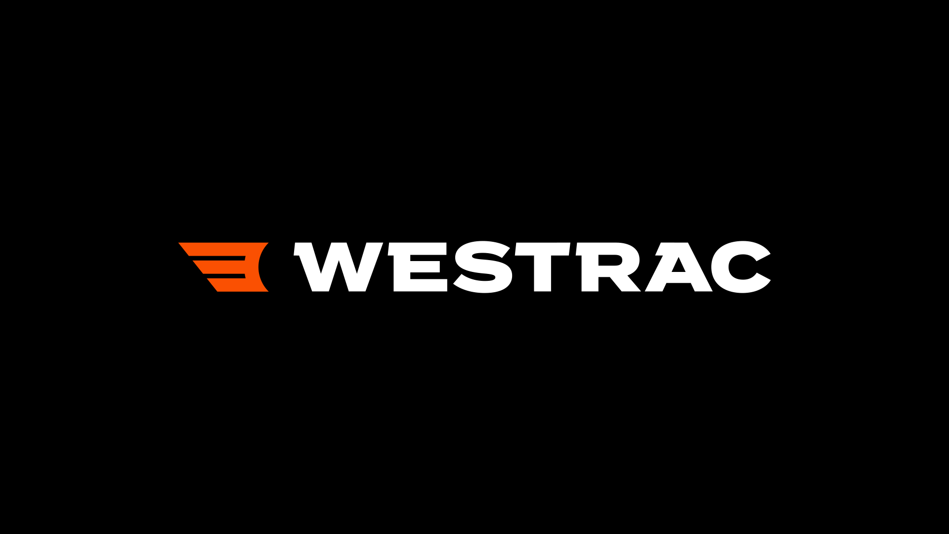
We created a new logo featuring an abstract wing icon, symbolizing movement, growth, and upward trajectory. The wing suggests agility and progress, while subtly integrating a ‘W’ for memorability. Bold typography and a strong color palette reinforce professionalism and approachability.
The Results
The rebrand elevated Westrac’s image, aligning it with its reputation as a trusted, modern leader. Early feedback highlights increased recognition and resonance with customers.
Westrac’s new identity reflects its values and ambitions, combining modern design with reliability. The refreshed brand positions Westrac as an industry leader, ready to support customers and drive growth.